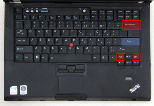
Look at the image below. It’s the photograph of a keyboard very similar to the one of the IBM ThinkPad T43.
See the keys I have highlighted? Those are the ones designed with usability in mind.
“Hey, let’s give the user three different ways to accidentally navigate away from the web page they’re looking at.”
“But wait… if they navigate away accidentally they’ll lose what they were typing. That’s in most browsers!”
“I know, right?” Wink.
This dialog may or may not have happened at IBM, but fact is, those page navigation keys are way too close to the directional keys. And the Backspace, so close to the Enter key, also raises issues.
Somebody tried to increase the usability of this keyboard by providing more choice, more ways to do something. It turned awry instead.

